Micro Case Study: Building Production Sites with an Extremely Fast Turnaround.
Design projects, beginning from the initial client meeting and ending in the finished live product, often take anywhere from a few weeks to years to fully complete. So what happens when this methodology gets turned on its head and you have 24 hours to create an on-brand landing page and event page?
Design projects, beginning from the initial client meeting and ending in the finished live product, often take anywhere from a few weeks to years to fully complete. Depending on the scope of the project, after the initial meeting establishing a budget and a timeline, you begin with user research, ensuring that you are solving the right problem and providing the best solution, before iterating the design into into something worth building.
So what happens when this methodology gets turned on its head and you have 24 hours to create an on-brand landing page and event page? In this micro case study about the Hart House Review, I will discuss how I took design best practices and cut them down to their core to deliver a project on time and per spec.
The Task
The Hart House Review (HHR) is a long running annually published Canadian literary magazine that publishes both new and established authors. While their printed presence is significant, the journal has been struggling to expand online over the past few years, and as a result, I was brought aboard to help rethink the brand and leverage their offline audience to kickstart their online presence.
While I would have the opportunity to rethink and restructure the brand in greater detail later on, the catch was that by the time I got started, their Winter Supplement was set to launch within two weeks, and they needed a promotional page for their advertising yesterday. As a result, the detailed brand would have to wait, and a page built to support this launch, introducing users to the brand, was needed promptly. And so my goal was set: A Landing Page and a Winter Supplement Page, within 24 hours.
The Pipeline
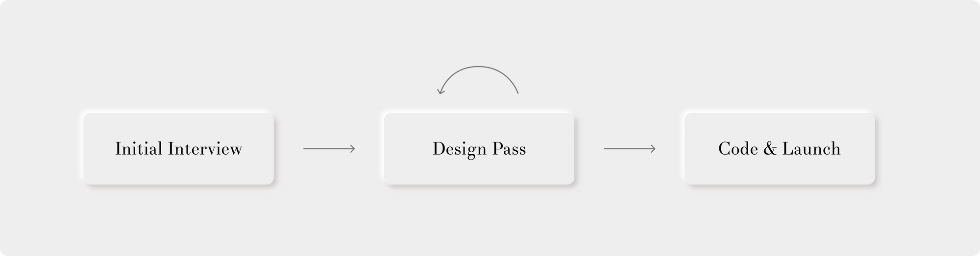
Since I didn’t have the time or team to do a full double-diamond design study, I had to cut down the process into three critical steps:
- The initial interview to determine some information about the brand and Editorial team’s vision.
- A design pass of the pages they needed (with revisions)
- Coding the project and deploying it to replace their current page.
Apart from the initial interview, all communication would be over Slack, all design sharing would be over Figma, and all code would run through a CI/CD pipeline on Zeit every time that I committed to master on GitHub.
Initial Interview
Knowing the scope of this first project, I wrote up an interview instrument to get some ideas about where the Hart House Review stood now, where it wanted to go, and what the Editorial team wanted their brand to be. There wasn’t a need to dig too deep in this first meeting, but the answers to the following questions were insightful and provided an excellent jumping off point to design from.
- Who is your ideal customer? What kind of people read the HHR?
- What kind of personality does the HHR have? (Assign human set of characteristics. i.e. Apple: Rebel; Mec: Outdoorsy person)
- What is your competition?
- How do you make your readers feel? (Relieved? Inspired?)
- Why are you different from other journals?
- Why do readers trust you? (Transparency? Expertise?)
- What's your story? (Why does the HHR exist? How does it come about?)
- What are five words that describe you? (e.g. quality, consistency)
- What do you feel is lacking in HHR’s current identity?
- What do you want your readers to know about you?
- What brands do you admire? (doesn’t have to be other journals)
- What does your voice sound like? (academic vs. conversational)
- Where do you see the HHR in five years?
Despite the limited time, the importance of this first interview cannot be stressed enough. I could have whipped up two pages and presented them to the HHR on the same day that the task was assigned, but I would have failed at creating the first building blocks upon which the HHR’s online identity would stand on. I would have created something that I thought ‘looked nice’ but not something that the Editorial team would have been proud to represent themselves by. So, despite the effort and time required, I knew that the interview was a step I couldn’t forgo.
I collected the Editorial team’s responses along with a preferred colour palette and typeface, and got to work.
Design Prototypes and Review
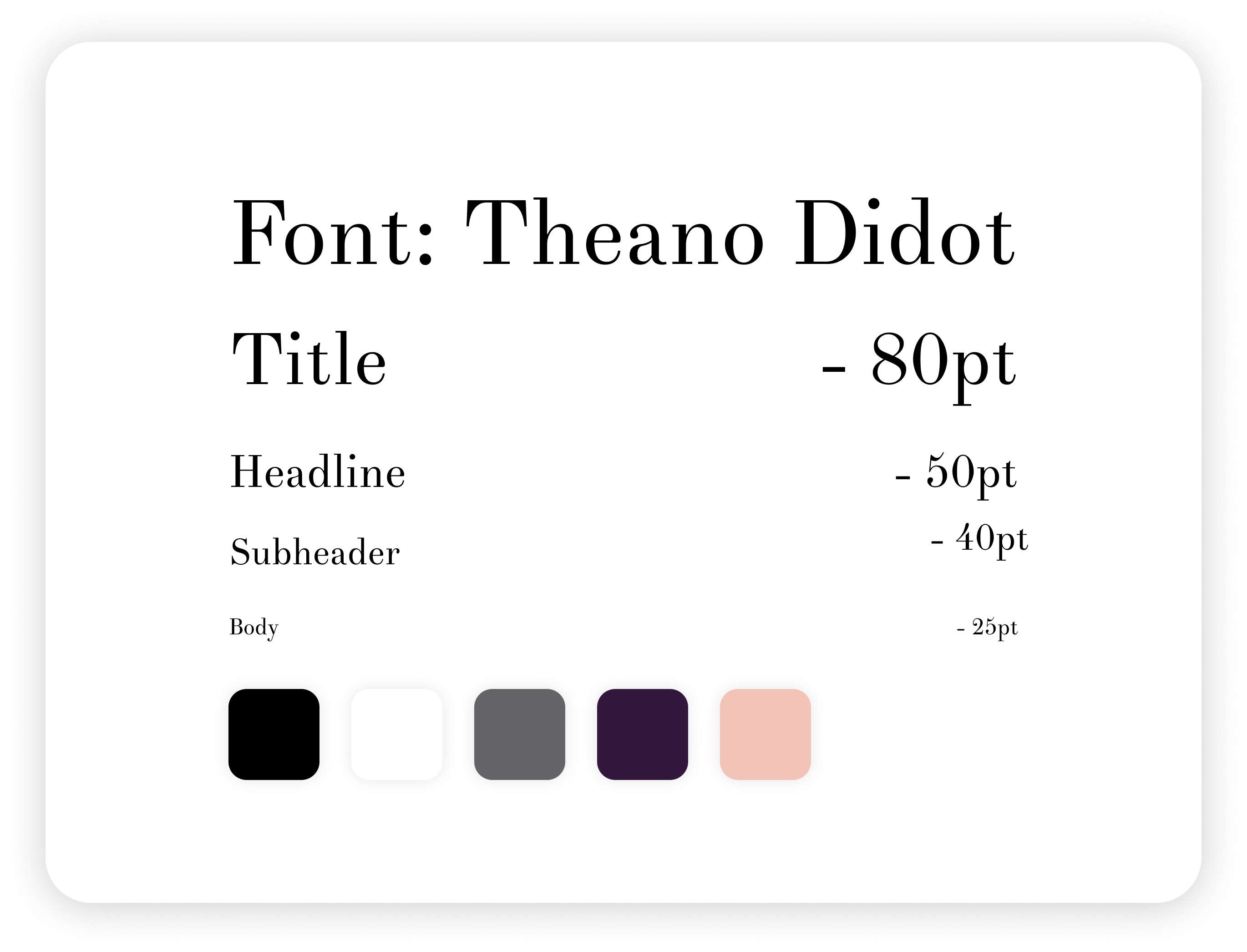
First and foremost, I put together a quick style guide of the preferred font: Theano Didot, along with some working colours that the Editorial team thought fit the brand well. The emphasis was on a black and white journal-esque aesthetic, but there would be room to experiment.
After some research into known competition and model sites that the HRR had listed in their interview, I settled on the idea of maintaining the journal theme and creating pages that would feel at home as card stock print outs on someone’s desk, on top of being useful and beautiful web pages.
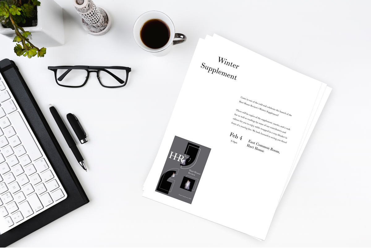
So, I started with a simple sheet of letter paper and thought: how could I make this look great both on print and online?
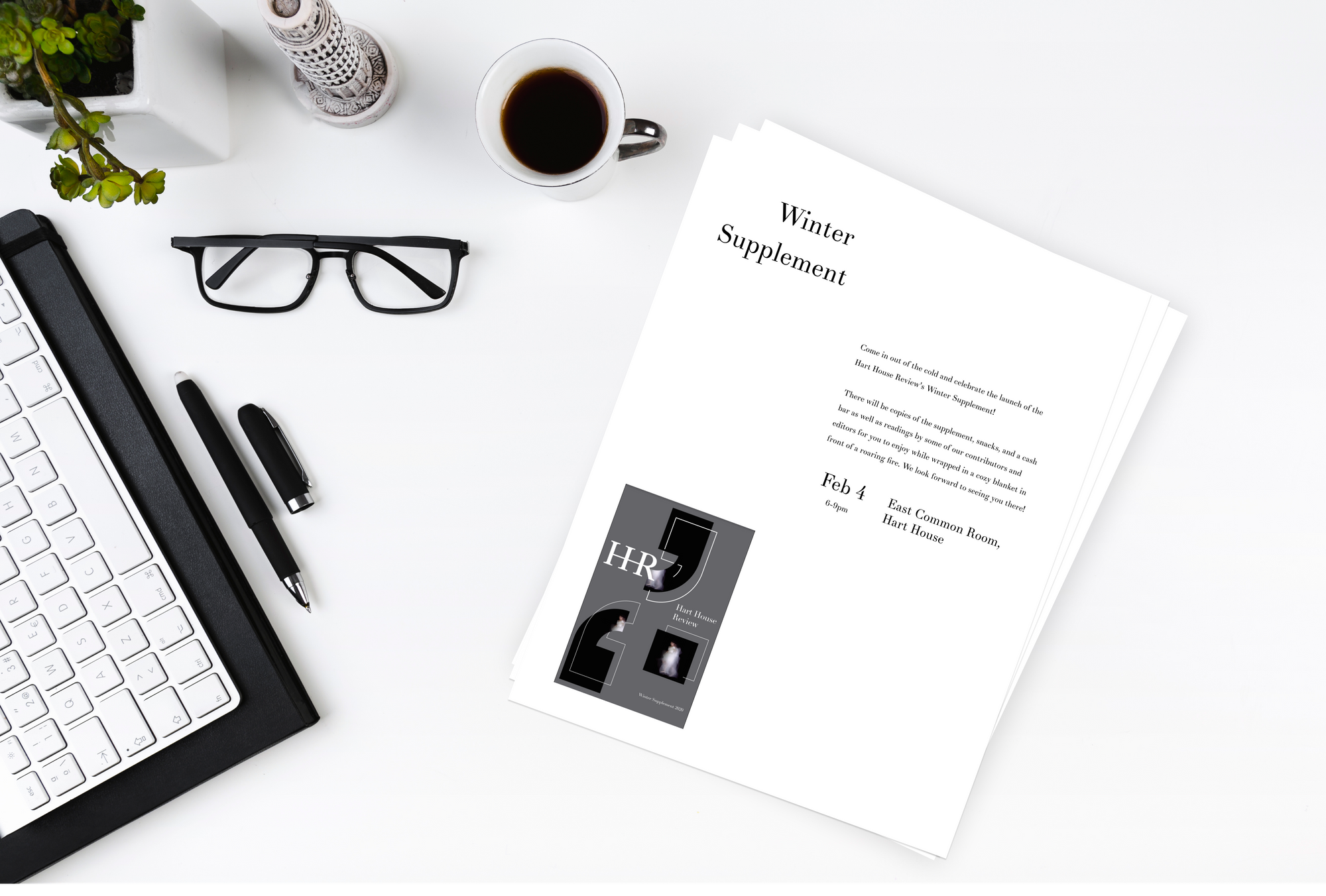
After some more research and trial-and-error, I came up with the above design. I kept it very simple with swaths of empty - but meaningful - space, and a focus on information delivery for the Winter Supplement launch.
Transforming this into a desktop and mobile view was fairly straightforward, the only caveat that I received in my design review with the Editorial board was to also add links to social media somewhere on the page for viewers to follow.
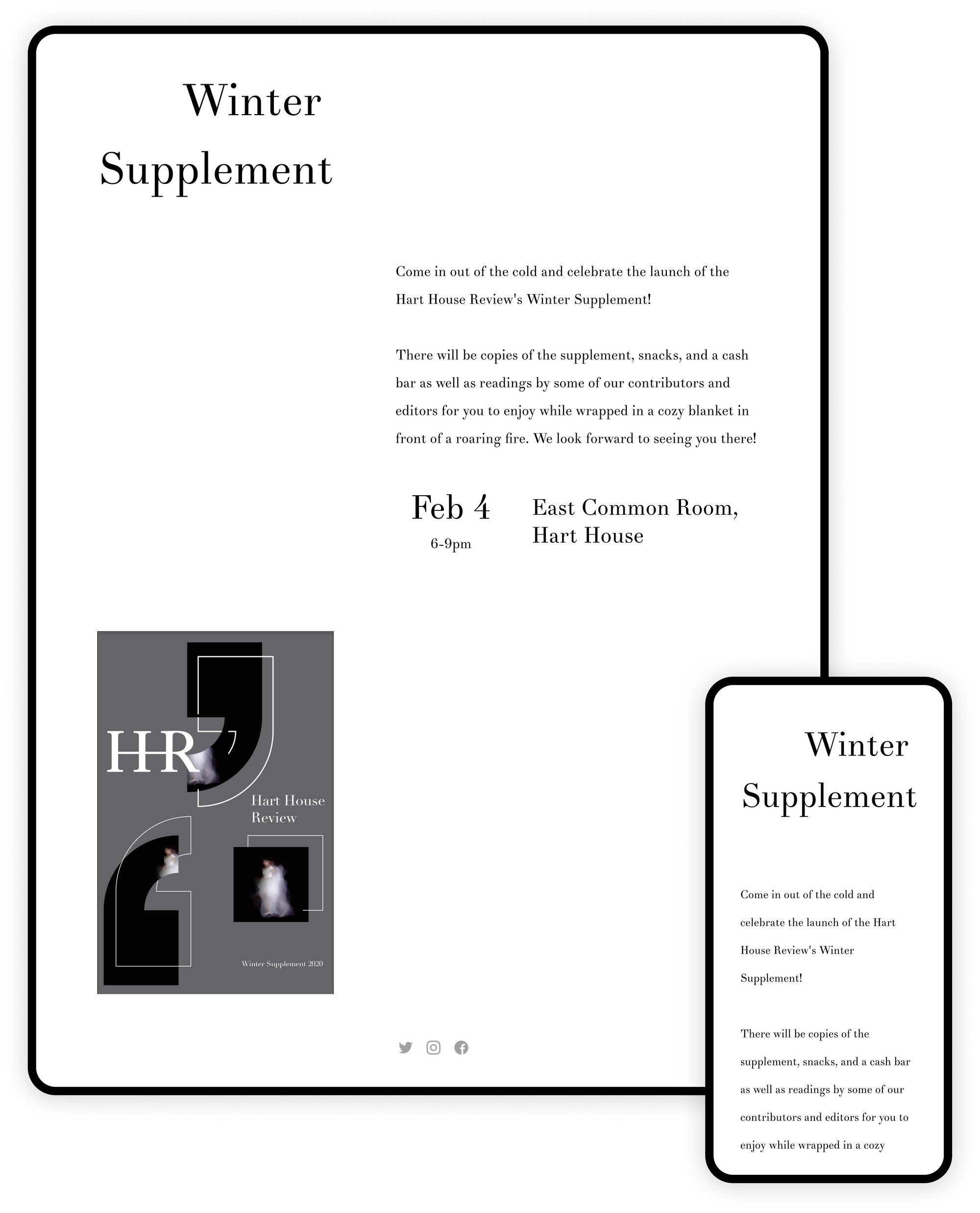
Though a controversial decision, I decided not to include any kind of navigation on this event page because I felt that it would clutter the experience and as the only use case of this page was direct linking in promotional material relevant to the event, there was no need to navigate.
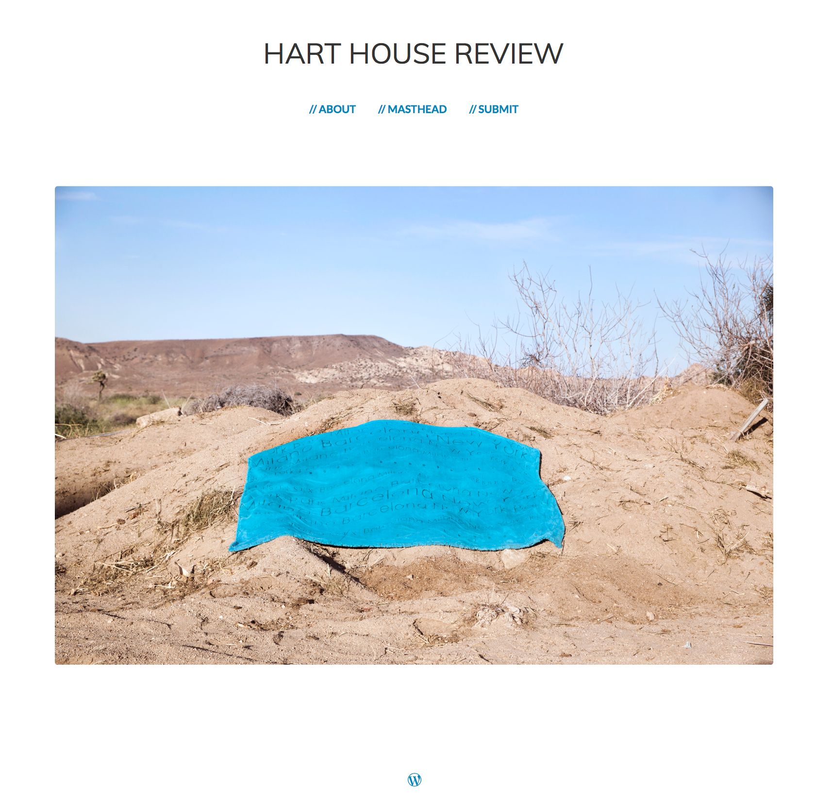
The new site would also need a landing page, and I was asked to create a temporary ‘under construction’ page with all current information about the Hart House Review on it. This page would inform users that the full website would be coming soon, directing them instead to look at the winter supplement or submit pieces for consideration.
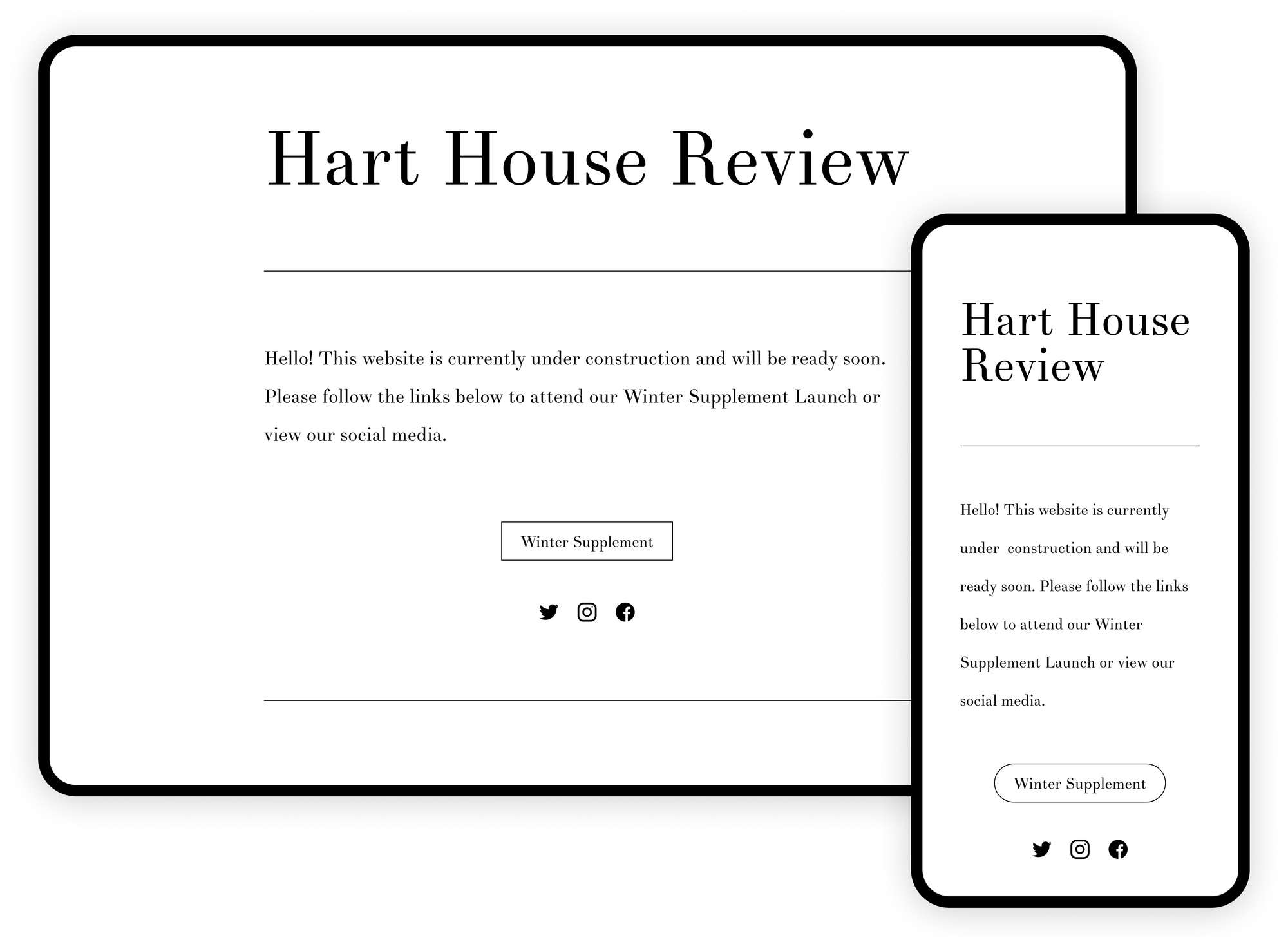
I presented several potential designs, but the one above was favoured due to its clear and concise information delivery and simplicity - for the time being.
There is a lot of room for exploration for the future final design of the Hart House Review, but with these two designs accepted, I switched focus to coding and releasing them ASAP.
Code and Production Release
I started off by creating a GitHub repo and setting up a basic framework with Bootstrap, Google Analytics, mobile compatibility, metas, fonts, and favicons.
After this, I hooked up Zeit to the GitHub repo and set up a pipeline that deployed to a temporary domain every time I pushed to master for quick verification that everything worked in production, and easy sharing with the Editorial team.
With only two pages, there was no need for any fancy Angular or NextJS set up, the page would be written in good old fashioned HTML.
The simplicity of the designs did actually lend itself well to quick coding: Bootstrap columns assisted in the quick assembly of both the desktop and mobile views of the Winter Supplement page, and variable font sizes with `em` made title handling on mobile simpler.
The only finicky bit was displaying the word ‘Supplement’ as a title on very small mobile devices such as the iPhone 5. I solved this with `hyphen` styling and giving the word a set place to ’split’ should the view width get too small.
<h1 style="text-align: right; font-size: 5em; hyphens: manual; -webkit-hyphens: manual; -ms-hyphens: manual;”>
Winter Supple­ment
</h1>But with this hurdle surmounted and both pages looking great on all tested screen sizes, the last step was to point the actual harthousereview.ca website to the Zeit server.
This ended up being a little more painful than it needed to be because the domain was registered with WordPress, who wasn’t a fan of DNS record changes away from their platform. But eventually, I pointed the DNS over to Zeit’s servers and waited for WordPress’ TTL (which you can’t change by the way but ended up being around an hour) to elapse, at which the harthousereview.ca now pointed to the new site.
Afterward, I sent over a quick message to the Editorial team that the site was ready for use in promotional material and that was that: first project complete.
Thank you for joining me on this micro case study about my early work for the Hart House Review! The extremely short timeline forced me to rethink much of my usual design process but the end result delivered a website that everyone was happy with and that could start establishing a stronger online brand identity for the HHR, starting with the Winter Supplement Launch.